Newcastle unveil brand new club crest - Official announcement video
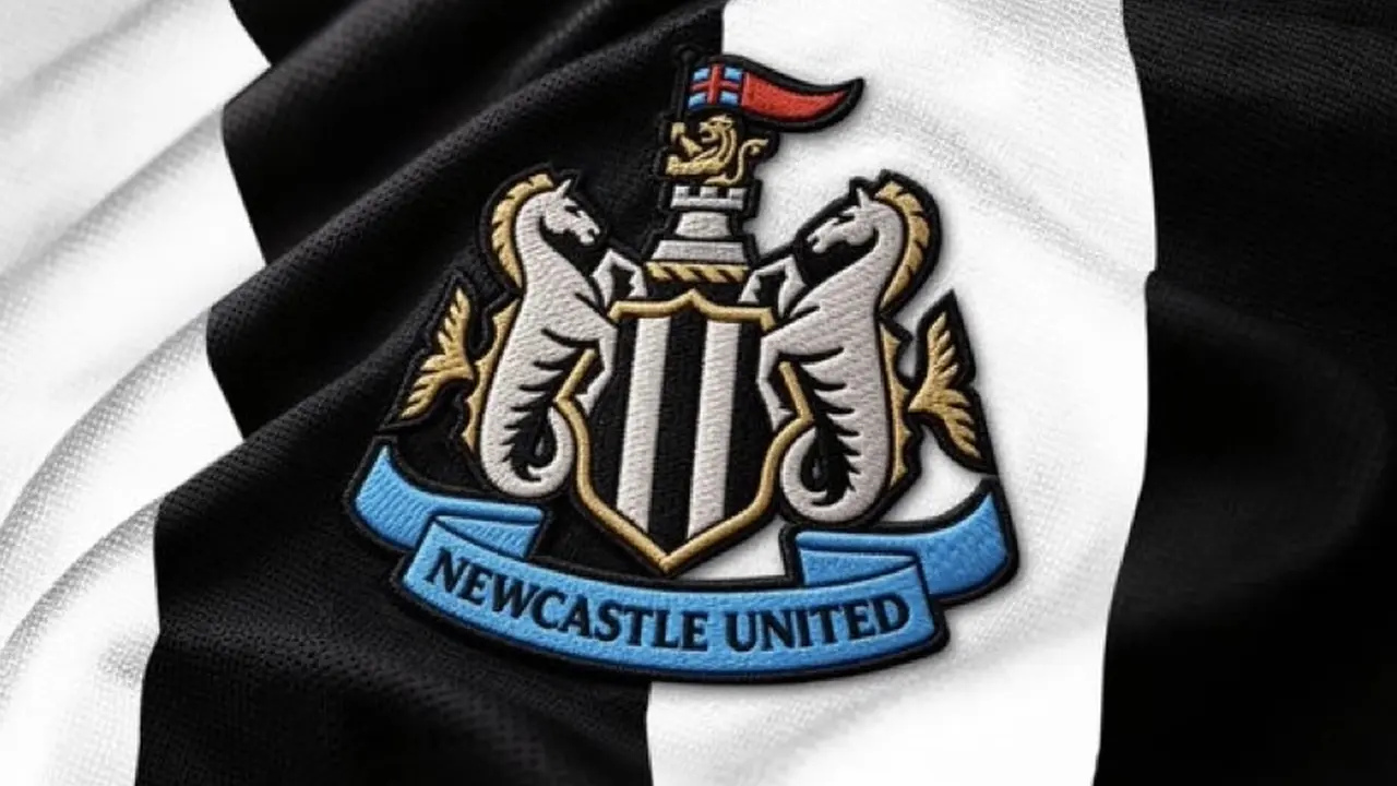
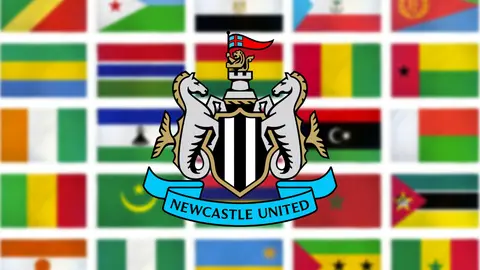
Newcastle United have officially unveiled a brand new club crest after more than two years of research, consultation and work with supporters.
The new design is an evolution of the famous crest which has been in place since 1988, with the club determined to modernise the badge while retaining its most recognisable features.
Supporters had their say on new Newcastle crest
A total of 27,348 eligible supporters took part in an independently administered poll, with the winning design receiving 64.8% of first-choice votes.
The redesigned crest retains the castle, black and white shield, hippocampi, demi-lion, pennon and ribbon, although each element has been refined to make the badge work better across modern digital, broadcast and merchandise platforms. As the club announcement highlights.
'The new crest will be used from today and will be put in place progressively across physical signage and digital and broadcast platforms over the coming months. It will be in place on our kits for the 2027/28 season.'
Newcastle say the castle has been fortified and made sharper and more distinctive, while the shield and other elements have also been redrawn.
The club will begin progressively introducing the new crest across signage, digital and broadcast platforms over the coming months, with the new badge set to appear on Newcastle’s kits from the 2027/28 season.
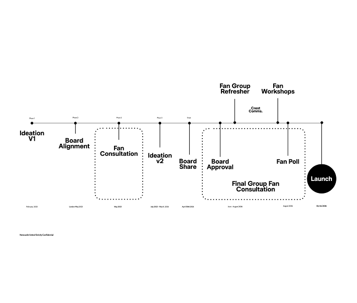
The club has also confirmed that the existing crest will remain in use during the current season, and revealed the processes behind the scenes that saw us get to this point:
A modern twist on a classic design
My biggest fear when the 'new badge' chat first emerged was a brand new badge with no real connection to the club, our colours and our history. Something we just couldn't relate to.
However, despite a niggling feeling it's just a poor imitation of our 1988 classic, I like the fact it's been kept so similar to our original, only modernising it slightly to help it work more efficiently across modern digital, broadcast and merchandise platforms.
What do you think of the new design? Is it just a sleeker modern twist on our previous badge, or have they made a mess of it? Let us know in the comments below.