Update on Newcastle's new badge - Key findings from Wednesday night workshop
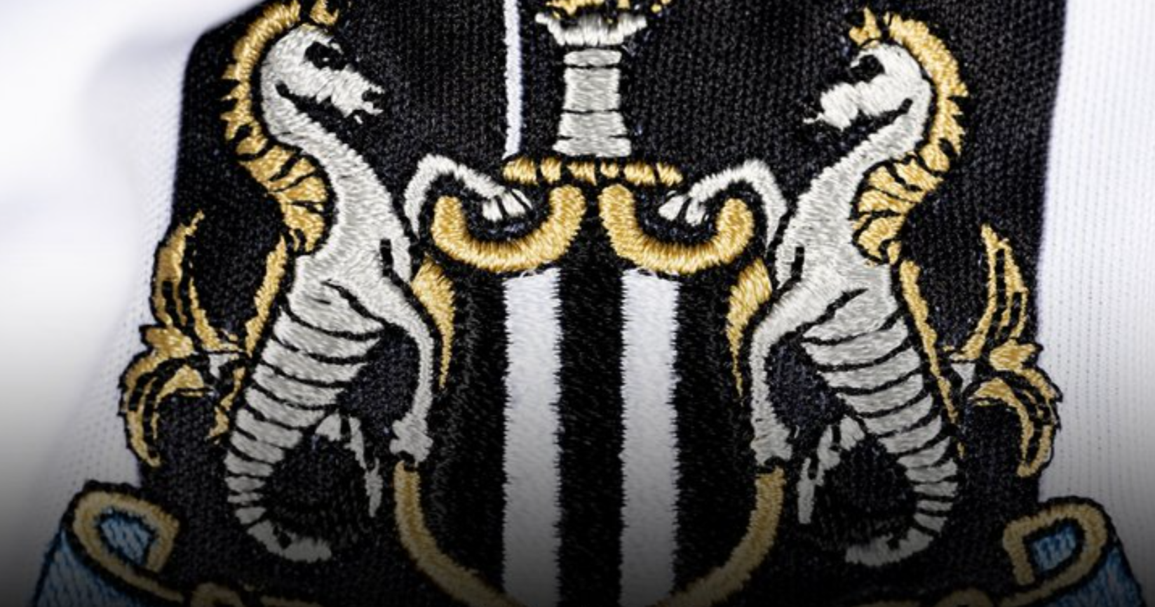
At 6pm on Wednesday, a supporter consultation workshop took place at St James' Park and online regarding the next steps for Newcastle United's crest.
It emerged last Friday that the club are planning to revive the current badge 'together', with season ticket holders and members contacted first in a bid to gain initial feedback.
However, last night allowed supporters to be updated on the current process and offer feedback for the club to consider. Here are some of the initial findings:
Feedback from fan event
As revealed by Newcastle United fan account NUFC360, who had a fan present at Wednesday's event, these were some of the key findings from the workshop
- Leaked image of crest was an internal image, but not close to a final design.
- Crest change is about refining and reviving, not reinventing
- There will be no circular crest logo
- Heritage at the heart of any change to the crest
- Fans will get the final say
After attending the event, Newcastle supporter and FourFourTwo editor Matthew Ketchell also revealed that fans were told the club are “categorically” against changing to a circular crest, as Man City have done in recent years.
Further updates from another fan (@bwbanter) who attended the event include:
- The leaked image (shared by NewcastleWorld) was 𝗖𝗢𝗥𝗥𝗘𝗖𝗧 but the club emphasised it was early stages
- The person overseeing designs is a Newcastle fan and worked for Nike for 15 years
- Research has been going on since August 2024
- The club aren’t in any rush to change anything - they’re already discussing kits for the 2026/27 season so everything is done way in advance
- The castle was voted as 𝗠𝗢𝗦𝗧 important to keep in fan surveys, followed by the shield and banner
- Main current issues include symmetry, the lines on the seahorse mane, the banner inconsistency and jokes from external brands about the lion looking like other creatures on certain prints
Leaked badge real - but it's not gone down well!
Last week, NewcastleWorld revealed that the following design had been drawn up as one of several early proposals for consideration.
It looked like a messy anime version of the current crest and it seems supporters at Wednesday's workshop expressed their dislike, which has been taken on board.